
ADMIN GUIDE
Brand your Greentic Designer
Control how Greentic Designer appears to partners, customers and users. Apply branding at platform, partnership or tenant level, with more specific settings overriding inherited defaults.
Topic: Branding and white-labelling
One platform, multiple identities
Greentic Designer can use the default Greentic identity, a partner identity or an individual customer identity. Each organisation can have its own app title, logo, colours and sign-in experience.
How branding inheritance works
Branding is resolved from the most specific level available. A tenant can override selected fields while continuing to inherit the remaining values from its partnership or the Greentic platform.
Platform branding
Default Greentic identity
Partnership branding
Default identity for member tenants
Tenant branding
Customer-specific overrides
Example
ACME Consulting partnership
├── ACME Consulting tenant — inherits ACME branding
└── Northstar Connect — overrides the logo, title and primary colour
Northstar Connect and ACME Consulting are both member tenants of the ACME Consulting partnership. The ACME Consulting tenant renders the partnership identity, while Northstar Connect replaces selected fields with its own identity — as shown in the sign-in comparison above.
Branding guides
Brand a partnership
Partnership branding becomes the default identity for every member tenant that does not define its own override.
- 1Open Partnerships.
- 2Select the partnership.
- 3Open the Branding tab.
- 4Enter the app title.
- 5Upload the partnership logo.
- 6Configure the primary, accent and logo-background colours.
- 7Select the interface skin and font family.
- 8Review the preview.
- 9Select Save.
What each setting controls
- App title
- The name displayed beside the logo and throughout the branded Designer experience.
- Logo
- The organisation or product identity displayed on the sign-in page and in supported Designer areas.
- Primary colour
- The main brand colour used for prominent branded surfaces, primary actions and key interface highlights.
- Accent colour
- A supporting colour used for lighter highlights and complementary interface states.
- Logo background
- The colour placed behind a logo when additional contrast is required.
- Skin
- Controls whether supported interface areas use a light or dark visual treatment.
- Font family
- Controls the typeface used throughout supported branded areas.
Inherit, replace or clear a value
Branding settings can be inherited from a parent, replaced at the current level or explicitly cleared.
| Action | Result |
|---|---|
| Replace | Configure and use a new value at the current level. |
| Reset to inherit | Remove the local override and use the value from the parent partnership or platform. |
| Show no logo | Explicitly display no logo, even when the parent has one. |
Example
ACME Consulting has a partnership logo. For Northstar Connect:
- Replace displays the Northstar logo.
- Reset to inherit displays the ACME logo.
- Show no logo displays no logo.
Preview before you save
Check how the app title, logo, colours, typography and actions work together before applying the branding to users.
- The logo is clear and not cropped.
- The app title remains readable at smaller screen sizes.
- Text has sufficient contrast against the primary colour.
- Primary actions remain easy to identify.
- The selected skin works with the logo.
- Inherited values come from the expected parent.
- Tenant overrides affect only the intended tenant.
- The sign-in experience works on desktop and mobile.
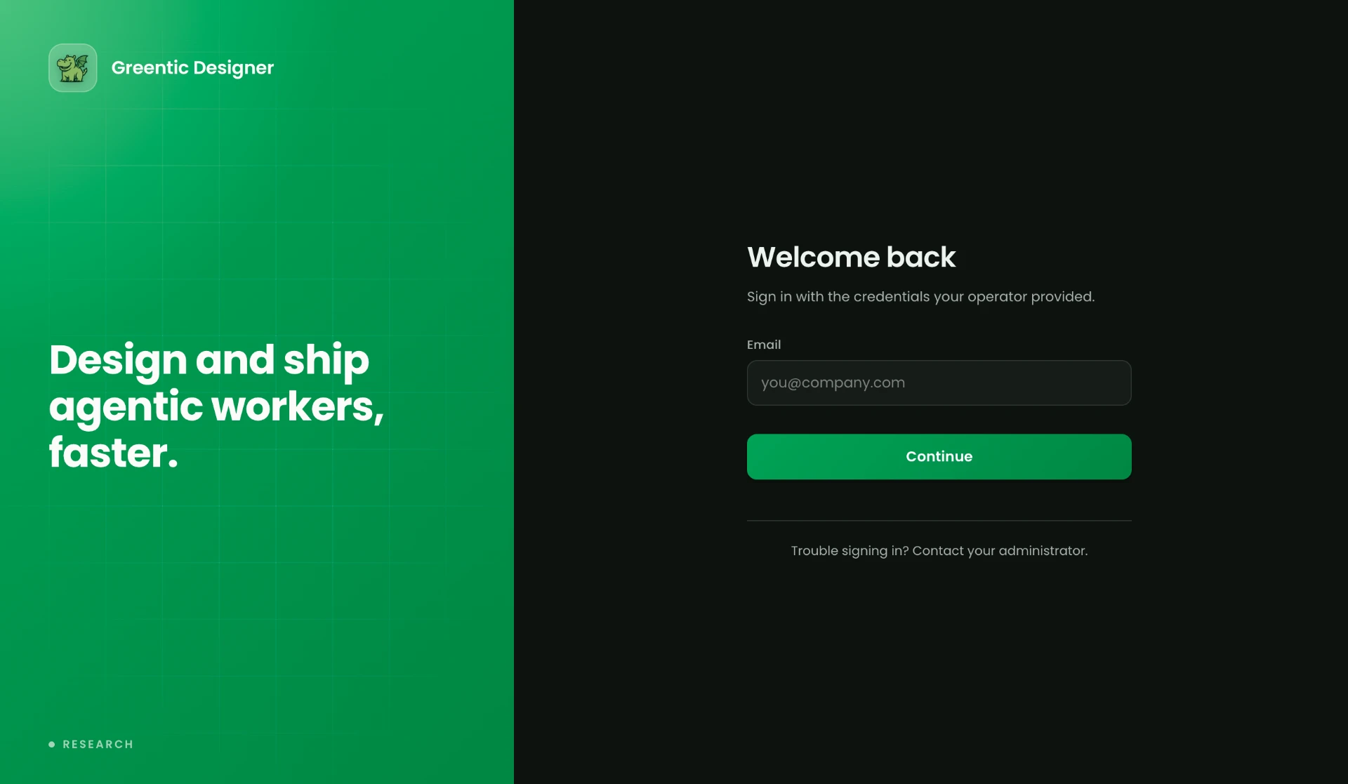
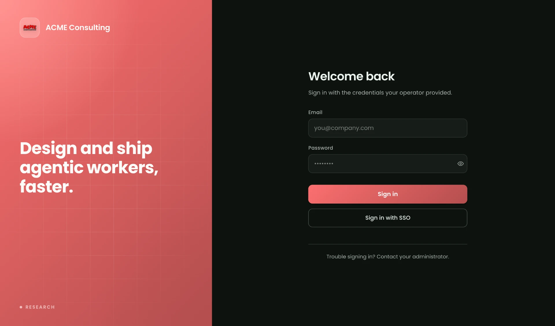
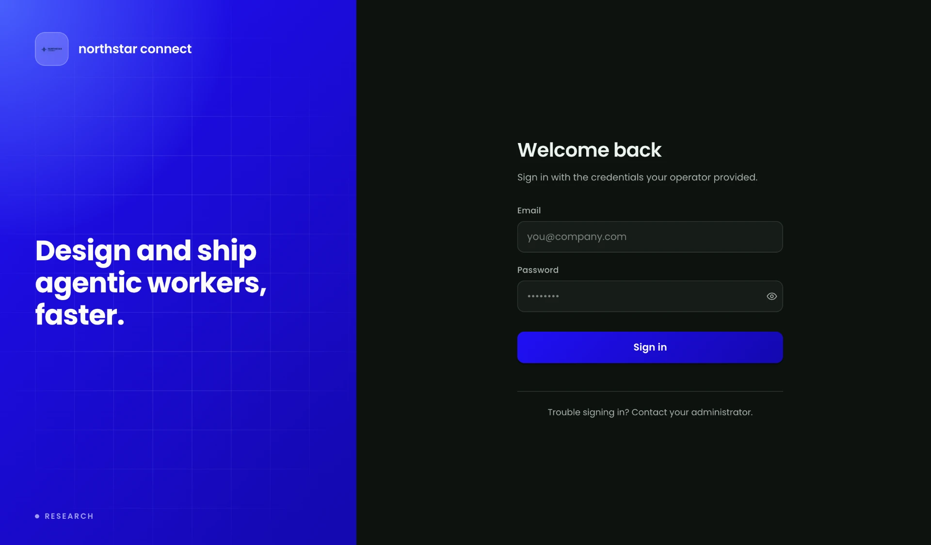 Compare the full sign-in examples at the top of this page.
Branding controls appearance. Domains control access.
Branding controls
- Logo
- App title
- Colours
- Skin
- Typography
Custom domains control
- The URL users visit
- DNS configuration
- Routing
- Domain verification